Best Pole Barn Color Schemes for Your Building
Selecting the right pole barn color schemes is more than just a design decision—it’s an opportunity to create something lasting and attractive. At Timberline Pole Buildings, we understand that every building tells a story. The colors you choose should reflect your project’s character and complement your surroundings, adding beauty and enhancing its overall design.
1. Best Pole Barn Color Schemes: Simple Yet Impactful
A multi-color scheme can give your building a vibrant and dynamic look. Most projects benefit from a combination of two or three complementary colors. While it’s possible to incorporate more than three, simplicity tends to create a more timeless aesthetic.
If you’re aiming for a distinctive look, consider using a variety of textures—stone, wood, or metal elements—rather than adding excessive color. These textures provide depth and personality without overwhelming the structure.
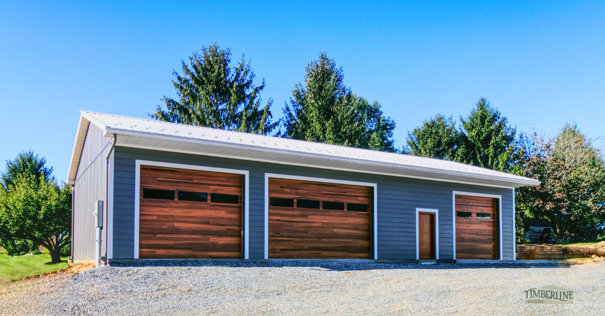
A well-balanced pole building using complementary colors and mixed textures like metal and wood for a unique visual appeal.
See how different siding, roof, and trim colors work together before you build. Use our Design Tool to test combinations and find the look that fits your property best.
2. Harmonize with Nearby Structures
If your new building is close to your home or other structures, harmonizing with their color schemes is a smart approach. This doesn’t necessarily mean an exact match but rather choosing shades that complement each other.
For example, if your home has a neutral exterior, like a white facade with a black roof, consider matching that theme or at least incorporating black accents in your building’s design. If your house features earthy tones with stone, integrating some stone elements into your building will create cohesion and balance.
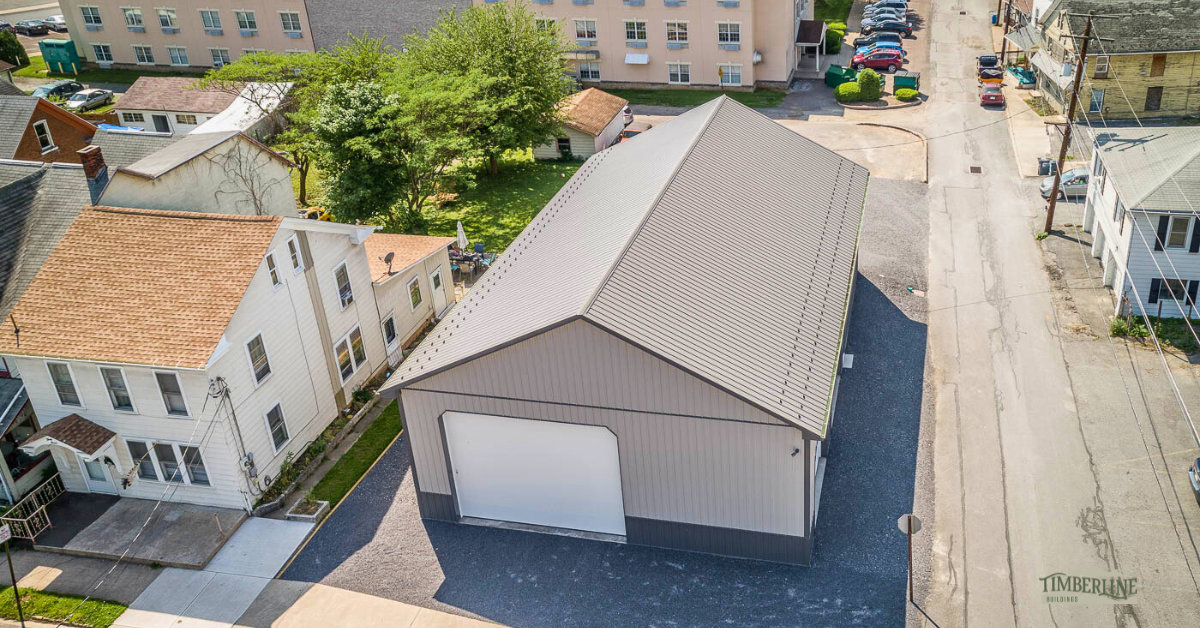
A pole building designed to harmonize with the main street, creating visual unity through matching roof and trim colors.
Not sure what will match your home or nearby buildings? Experiment with real color combinations and layouts before making a decision.
3. Contrasting Pole Barn Color Schemes: Bold, Yet Refined
While matching colors is a safe bet, don’t shy away from contrasting colors. A contrast can add interest and make your building stand out in a meaningful way. One of the most iconic examples is the traditional American red barn, which works harmoniously with various house colors.
However, it’s important to choose contrasts that align with your overall design philosophy—bold doesn’t mean clashing. A well-thought-out contrast can enhance your building’s visual appeal and make it a centerpiece of your property.
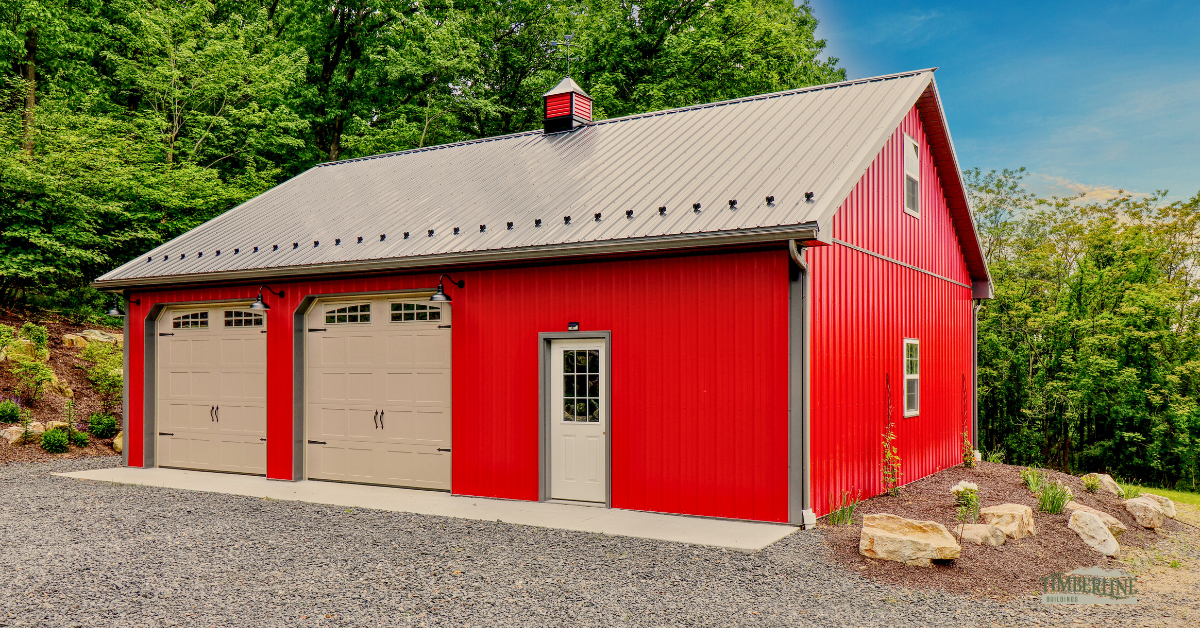
A bold use of contrasting scarlet red siding with a black roof, offering a striking yet classic appearance.
Have a bold color idea in mind? Our team can review your plan, walk through material options, and make sure everything feels balanced and timeless.
4. Stay True to Your Property’s Design Theme
Each property has its own unique design language, whether it’s western, cottage, industrial, or modern. Choose a color scheme that aligns with the overall theme of your property. Staying within your theme ensures that the building feels like a natural part of your space.
Whether your property has a rustic, log cabin vibe or a sleek, industrial feel, your choice of colors should support and enhance that atmosphere.
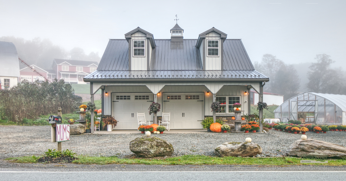
A farmhouse-style building that blends perfectly with the property’s overall theme through neutral colors and classic details.
Ready to move from inspiration to planning? Start designing your building or request a detailed quote tailored to your size, layout, and color preferences.
5. Textures and Materials to Elevate Your Pole Barn Color Schemes
Incorporating a variety of textures into your building design can make a significant impact. Stone, brick, galvanized metal, and cedar timber elements can all complement your chosen color scheme.
Consider complementing your pole barn color schemes with unique design elements like decorative lighting, stamped concrete walkways, or landscaping features. These additions create a well-rounded aesthetic that reflects Timberline’s craftsmanship.
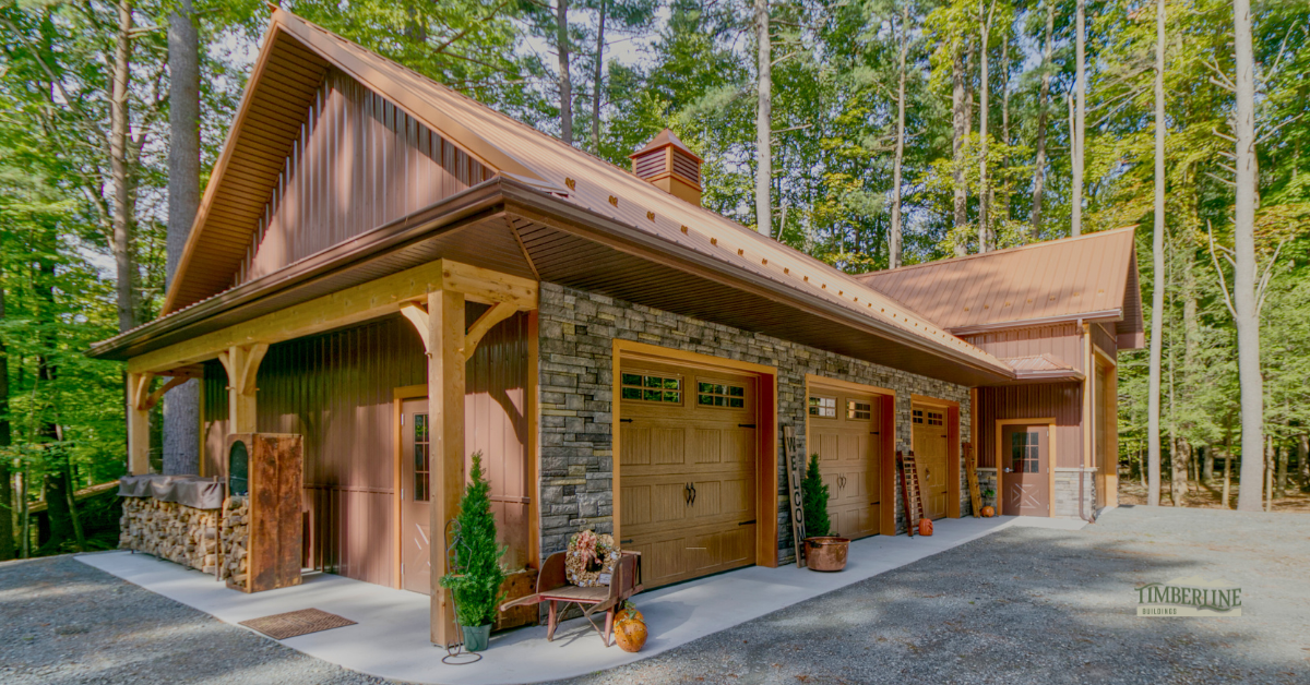
A high-end look achieved with a combination of stone, wood, and metal siding, enhancing curb appeal.
Final Thoughts:
At Timberline Buildings, we take pride in helping you create spaces that are both functional and visually pleasing. Choosing the right pole barn color schemes may seem challenging, but with careful consideration, your building can be both beautiful and timeless. Remember, the goal is not just to stand out, but to harmonize with your surroundings and reflect the essence of your property.
Ready to start designing your building?
Use our Design My Building tool to experiment with colors, materials, and layouts that suit your property’s style.
Once you’ve explored a few ideas, our team is here to help. We’re happy to talk through your plans, answer questions, and make sure everything feels just right—no pressure, just honest guidance from folks who build every day.
No signup • Takes 2 minutes
Personalized pricing • No obligation
Built in Pennsylvania • Amish Craftsmanship • Trusted Since 2003

